Case Study
China Global South Project - Nickel Interactive MapIndonesia is the world's largest nickel producer, yet comprehensive data on nickel development projects is rarely publicly accessible, much of it closely held by the government or private stakeholders. The China Global South Project set out to change that.
The CGSP Nickel Tracker is an interactive map that details nickel development across Indonesia, covering mining, processing, and battery production projects. It tracks 357+ projects involving domestic and international stakeholders, offering a transparent and comprehensive look into an industry that has largely operated without public visibility.
The CGSP Nickel Tracker is an interactive map that details nickel development across Indonesia, covering mining, processing, and battery production projects. It tracks 357+ projects involving domestic and international stakeholders, offering a transparent and comprehensive look into an industry that has largely operated without public visibility.
Commisioned by
simplefavor.xyz
Project scope
Web Design, Web Development
Web designer
Joseph Adisurya
Web Developer
Joseph Adisurya, Johanes Adika
The objective
To make a complex dataset of 357+ projects, multiple nationalities, and different project types and stages feel approachable and explorable without overwhelming the user.The design needed to serve two very different types of visitors: someone who wants to dig into the raw data and filter by specific criteria, and someone who wants to understand the broader picture through journalism and editorial coverage. Both needed a clear entry point, and neither should be buried under the other.
Landing page
The landing page opens with a dark, full-screen overlay, a deliberate contrast to the clean, light map interface beneath it. The two CTAs are kept intentionally simple: Explore Data and Explore Stories. These two paths reflect the two core audiences of the tracker, and separating them upfront reduces cognitive load before users even touch the data.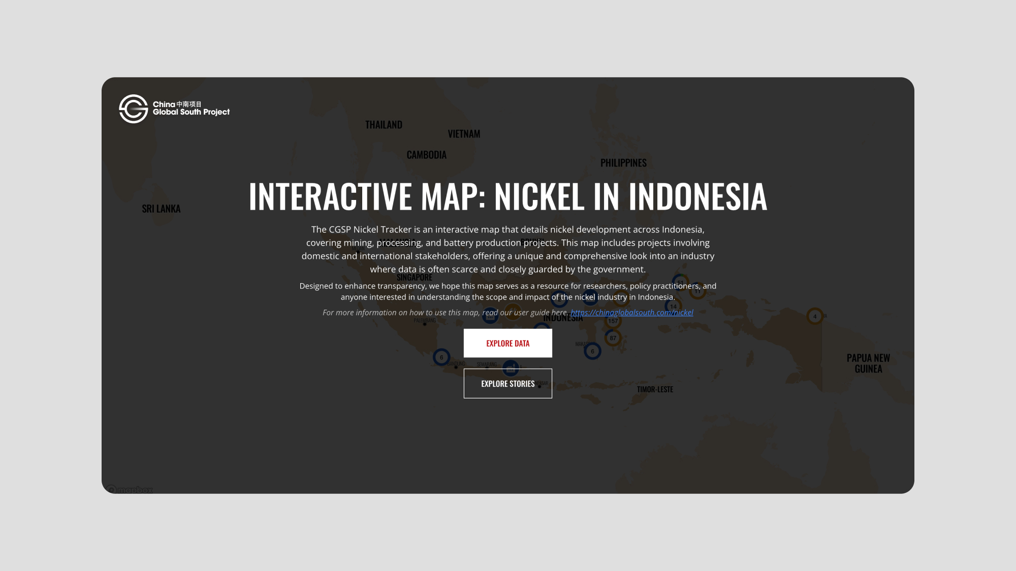
Interactive map
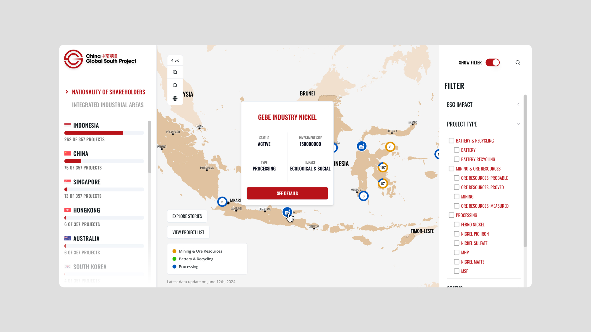
The map is the primary interface for exploring the data. 357+ projects are plotted across Indonesia, color-coded by type: yellow for Mining and Ore Resources, orange for Battery and Recycling, and blue for Processing. When multiple projects are close together, they cluster into a numbered pin to keep the map readable.The left panel shows the distribution of projects by nationality of shareholder. The right panel opens a detailed filter system covering ESG impact, project type, status, and more. Both panels can be used simultaneously, letting users cross-reference and narrow down the data from different angles.
Project detail
Hovering a pin shows a quick preview of the project, with name, status, investment size, type, and ESG impact at a glance. Clicking opens a full detail view with the complete data: shareholder nationality, shareholder name, production capacity, exact location, coordinates, and links to related articles. This two-step reveal keeps the map uncluttered while still making the full depth of data accessible.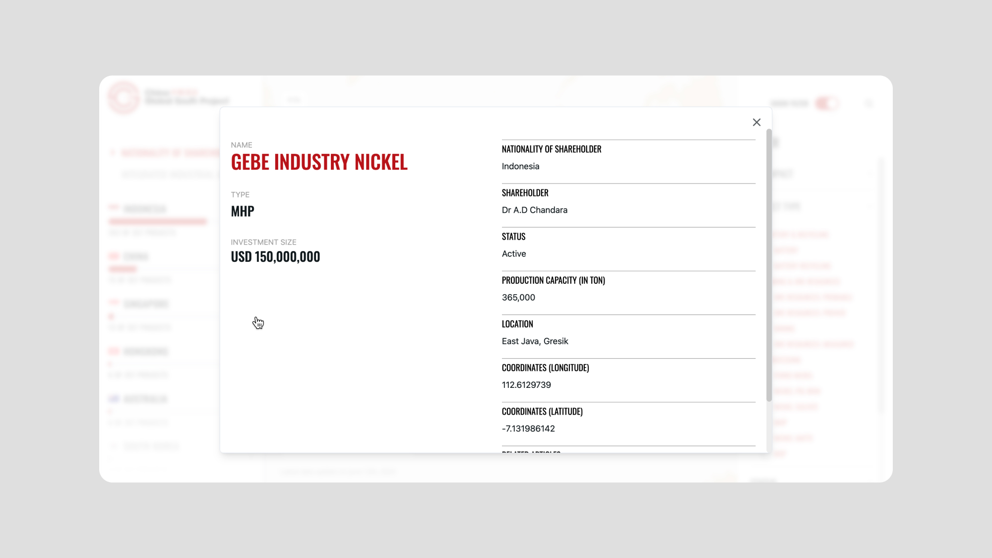
Integrated Industrial Areas
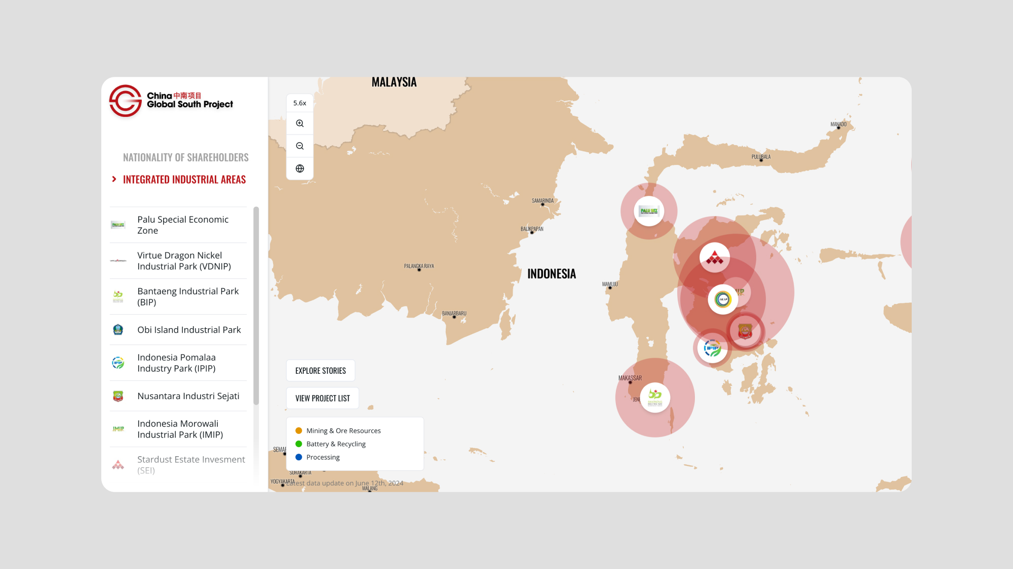
Beyond individual project pins, the map offers a second way to explore the data: by Integrated Industrial Area. This view groups projects by the industrial park they belong to and represents each park as a proportional bubble on the map. The left panel lists all parks with their associated projects.This is a meaningful alternative lens: rather than seeing 357+ individual dots, users can understand how nickel development is physically concentrated into a handful of major industrial zones across Indonesia.
Stories
Alongside the data tracker, the site includes an editorial layer: a Stories section covering articles, videos, interviews, photo stories, and podcasts related to nickel development and the projects in the dataset. The navigation between Stories and the Map is kept seamless, so users can move between raw data and contextual reporting without losing their place.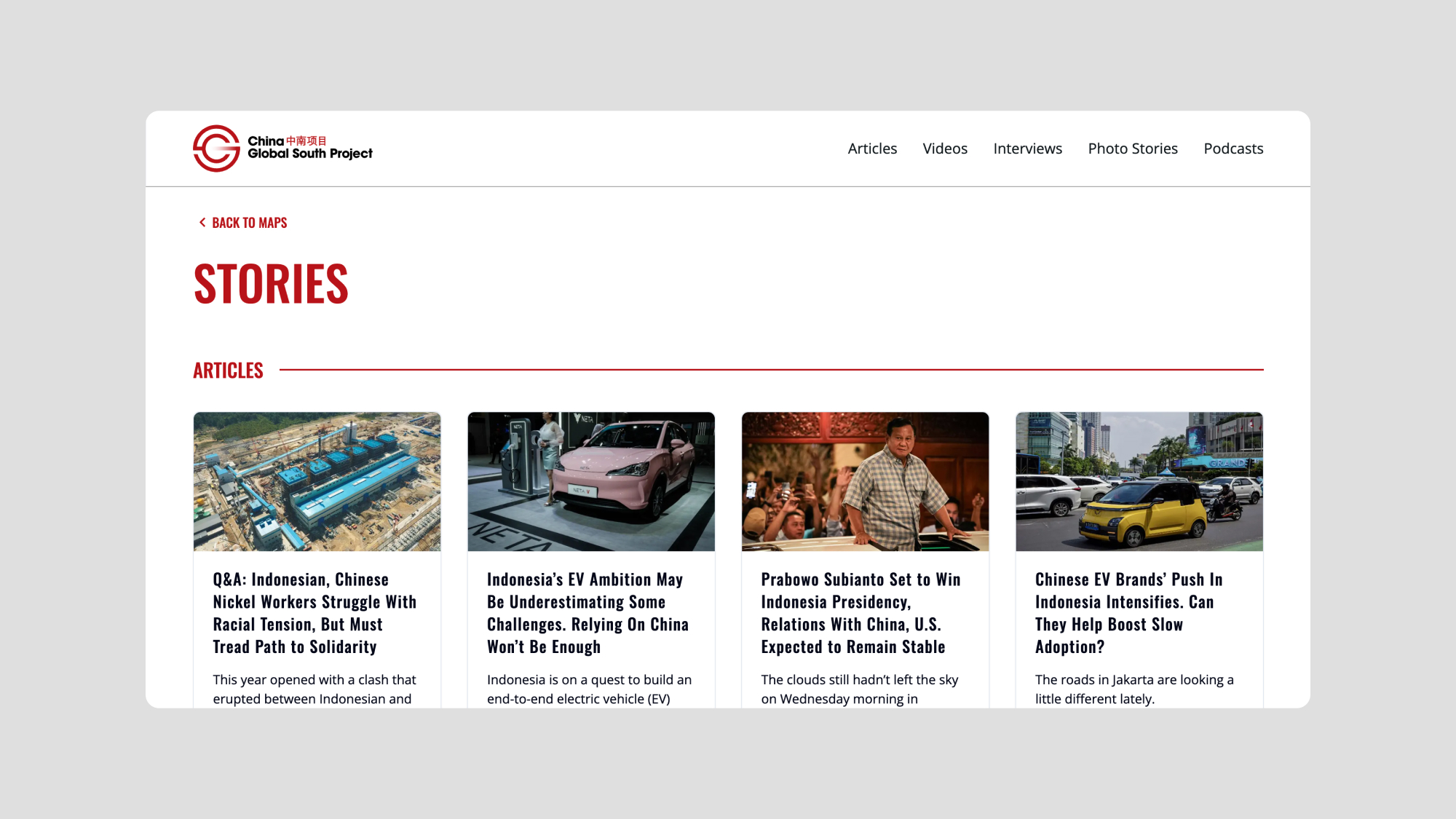
Other works
See all