Case Study
RolmoRolmo is an edu-tech company that aims to democratize education, starting with high-quality online video courses featuring role models from different industries. I designed all the interfaces from the mobile app, website, and design directions on the video courses.
Role
Product Designer
Project scope
UI/UX
The objective
To bring the best experience to learn through online video courses. The product must give the cinematic video courses the center stage, but at the same time also still bring the seamless experience for the users.The main screens
The app is pretty straightforward, the interface is intentionally made very clean so the content could stand out. There will be video courses that’s featured on the home page, but people could also filter them with the category tabs, based on their interest. For easier access, people can also search a video course or a role model. On the search page, they are also shown the recently watched course since they might want to revisit the course. All settings are combined into one page with the account settings for easier navigation.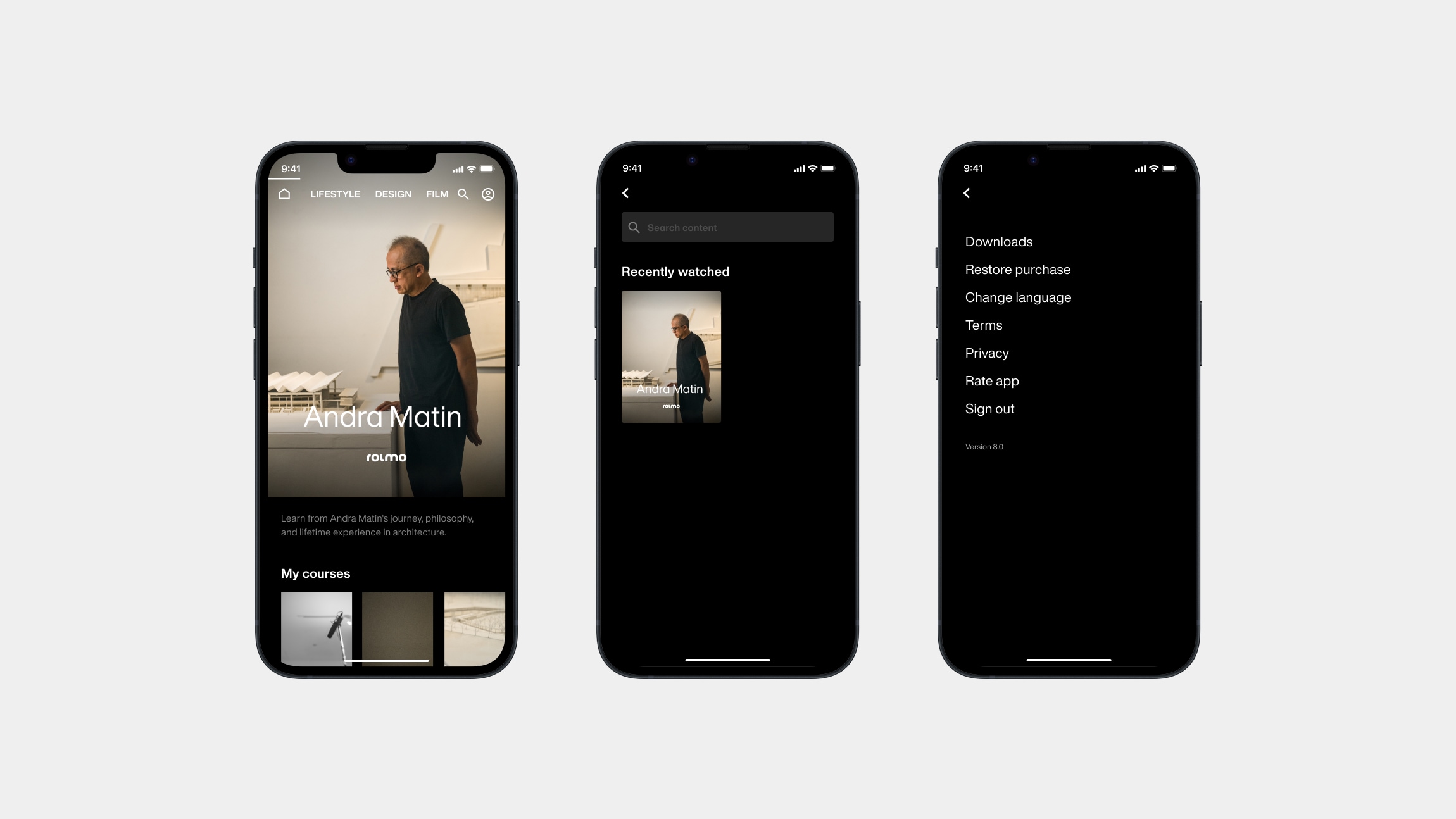
Learn from a role model
Each course has their own dedicated page. In the mobile app, people will be shown a trailer at the top, followed by the play button, description of the course, and the list of the lessons. They can download the lesson for a better watching experience. Some of the lessons also have extras of AR objects or 360 VR photos/videos for a more immersive learning experience. These extras can be found below the lesson related to it for better context. If they have watched a lesson but dropped off in the middle, there will be a mark on their watching progress.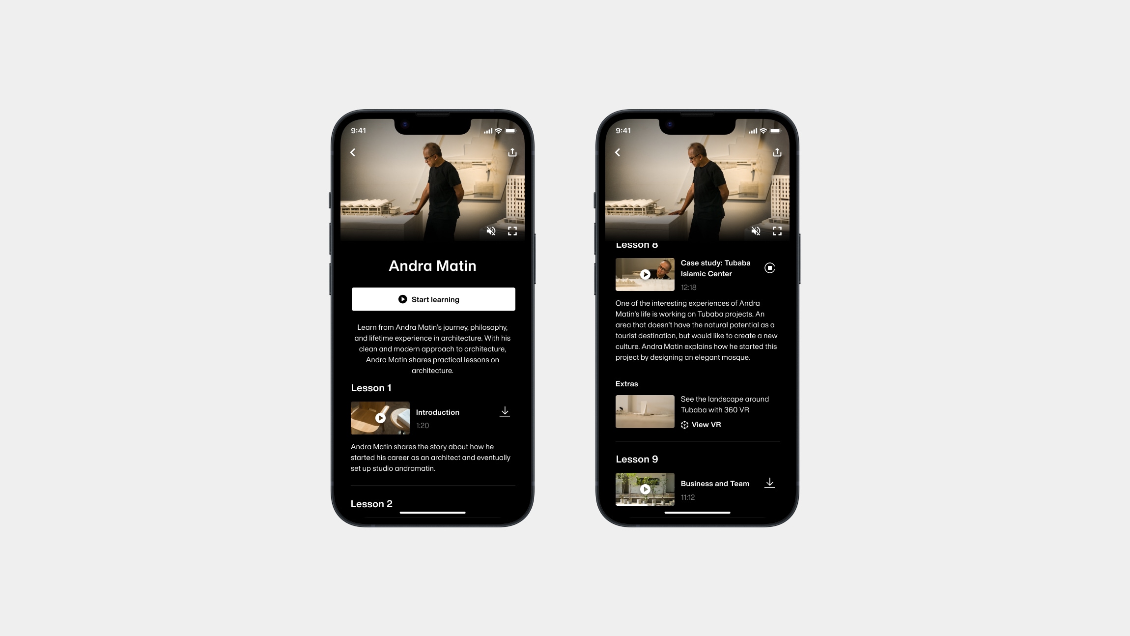
Bigger and easier to access
After testing the prototype and conducting some user interviews, the percentage of people who prefer to watch through a phone and laptops are apparently almost equal. These two behaviors are affected on which part of the day they watch the lessons. While mobile apps cater to the one who prefers to watch on their commute, the ones that dedicate time at home prefer to watch through a big screen. There is also a small percentage of people that prefers not to download more apps on their phone, and would just prefer to watch through a web-based app although it doesn’t allow AR/VR and offline mode.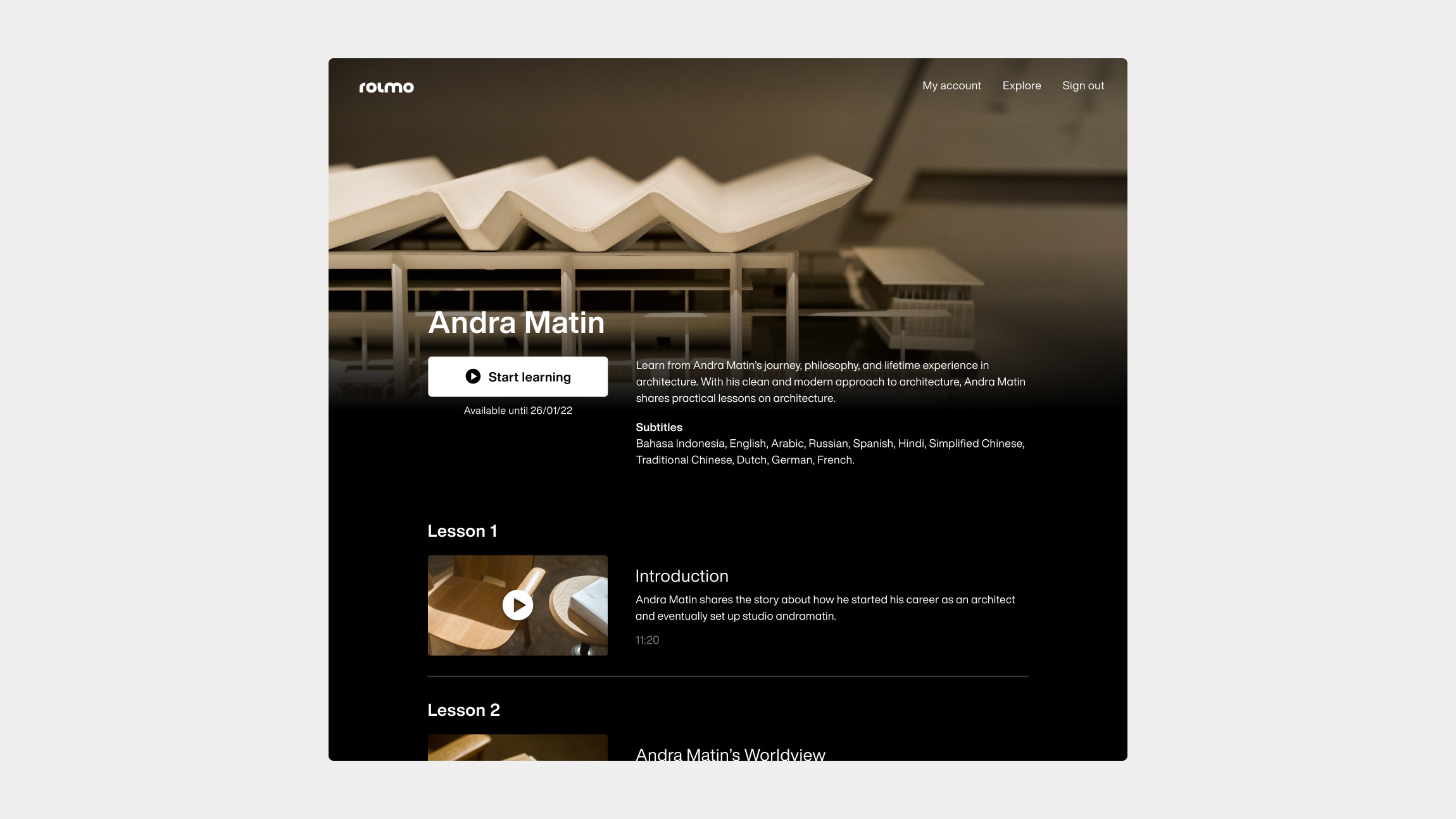
One video at a time
To maintain a seamless experience, we developed the same interface for the video player of both the mobile app and website. Since the nature of the contents are for learning, people are encouraged to focus on it, we only allow the lessons to be watched in a full screen mode. This will also build the cinematic experience better. When they want to move to a certain part of the lesson, they will be shown a thumbnail for easier navigation. The controllers that appear when they pause or move the mouse will show all the information they will need to navigate and control easily such as the current and full duration of each lesson, which lesson is it, navigating to other lessons, mute, and subtitle settings. Some of the layouts of the controllers are applied like the industry standard to make it easier for people to navigate because of the familiarity.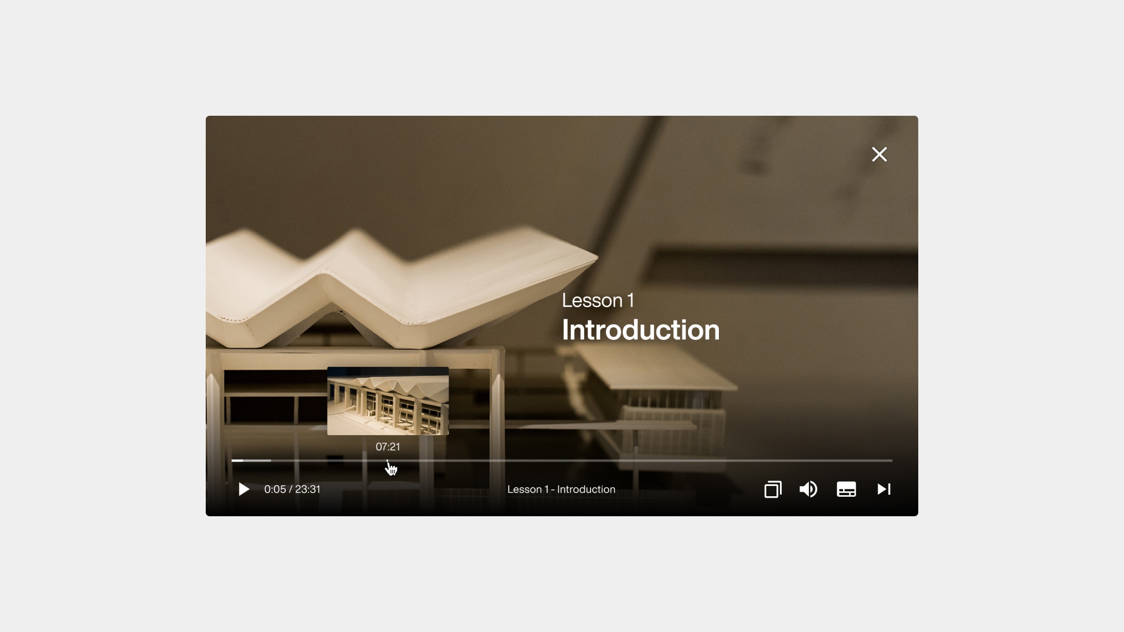
The conclusion
We built a mobile app and a web-based app that allows people to learn through online video courses with a clean and simple design so people can focus on the contents, and navigate easily. After the product launched, there has been very good feedback with many saying they love the app, with only several people asking about how to find other role models, which at that moment was not available yet.Other works